The visual side of the work.
Illustration, identity systems, and interactive art. Every venture and publication here started with a sketch.
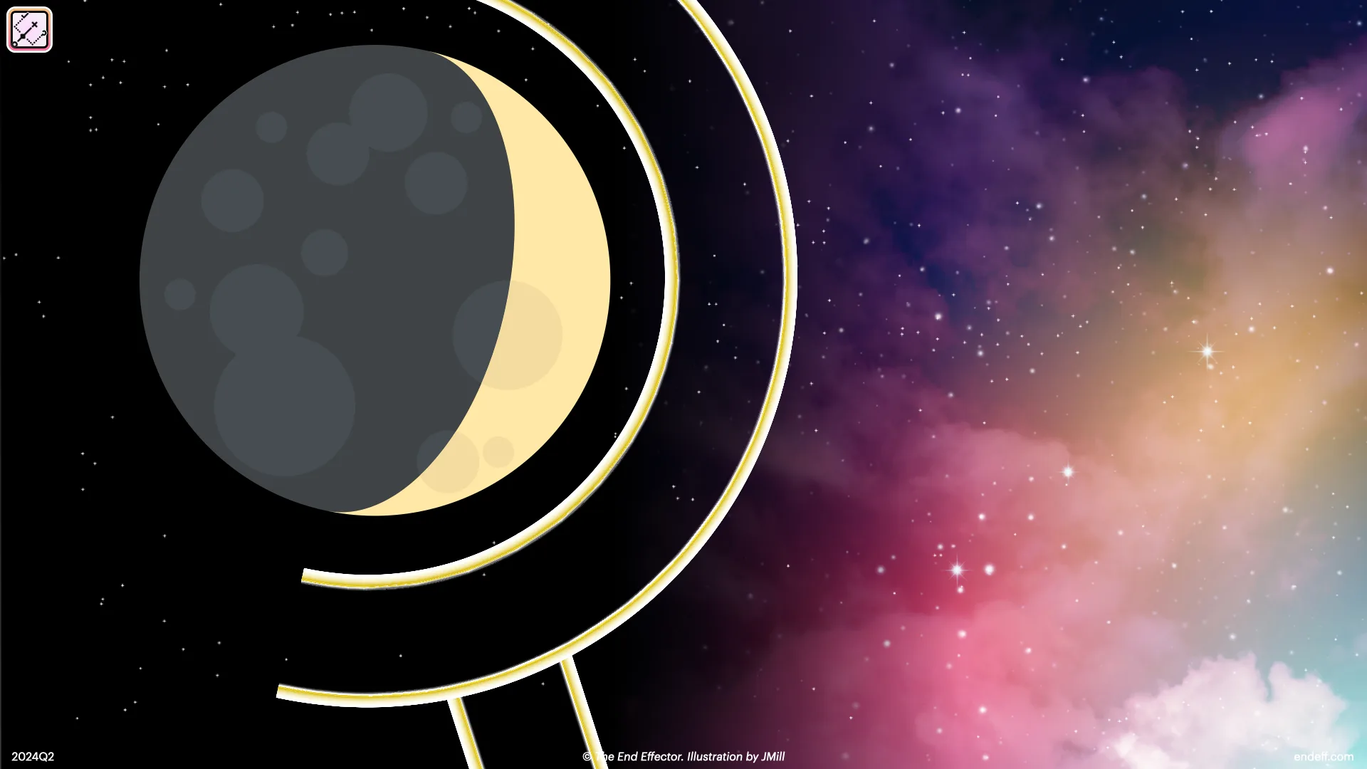
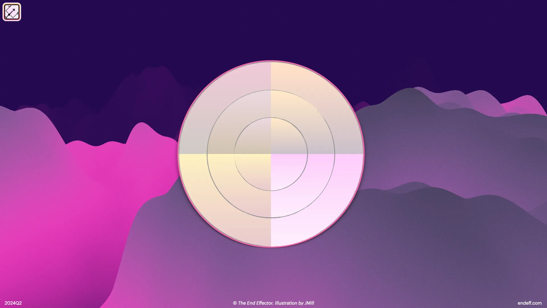
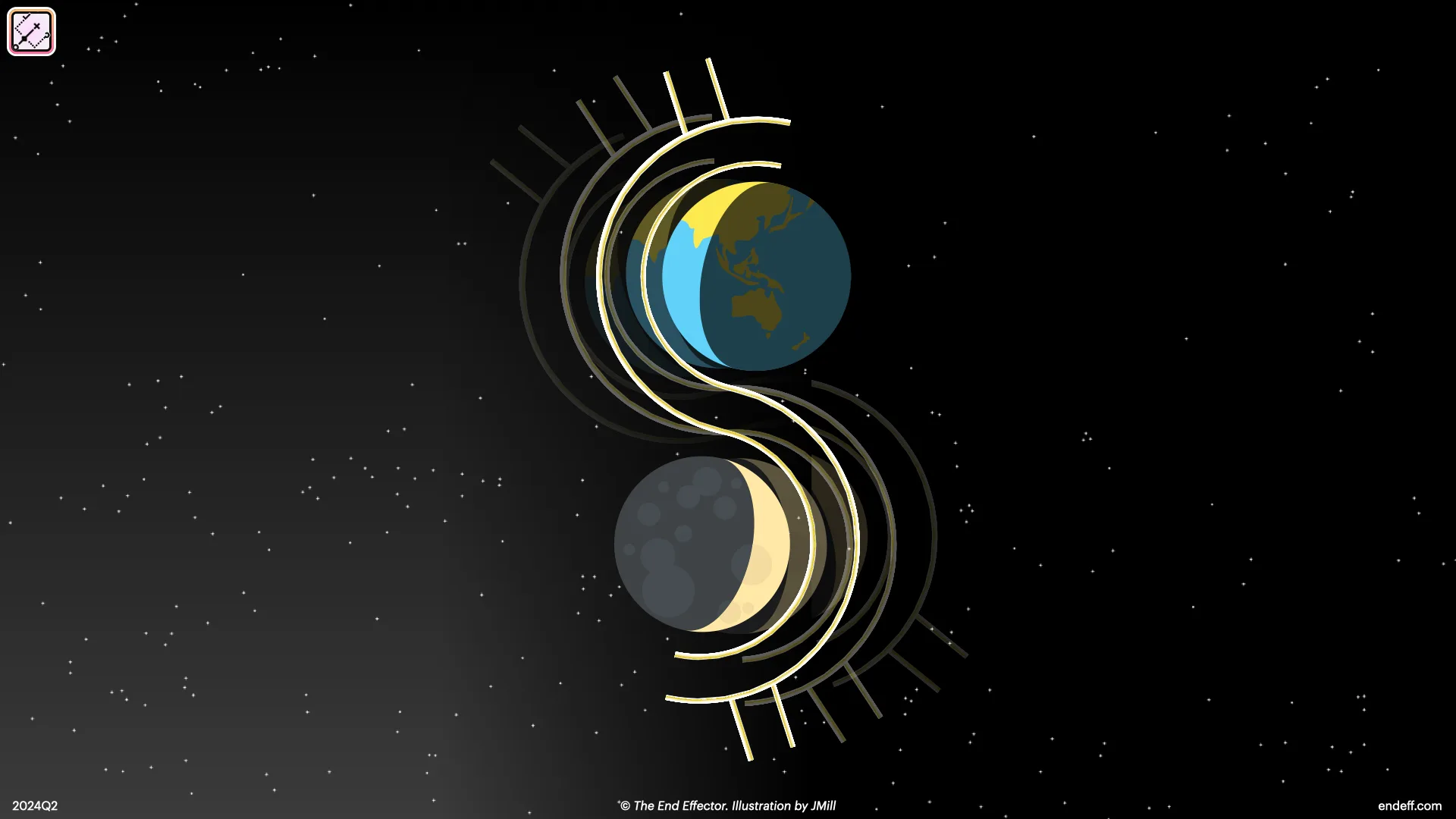
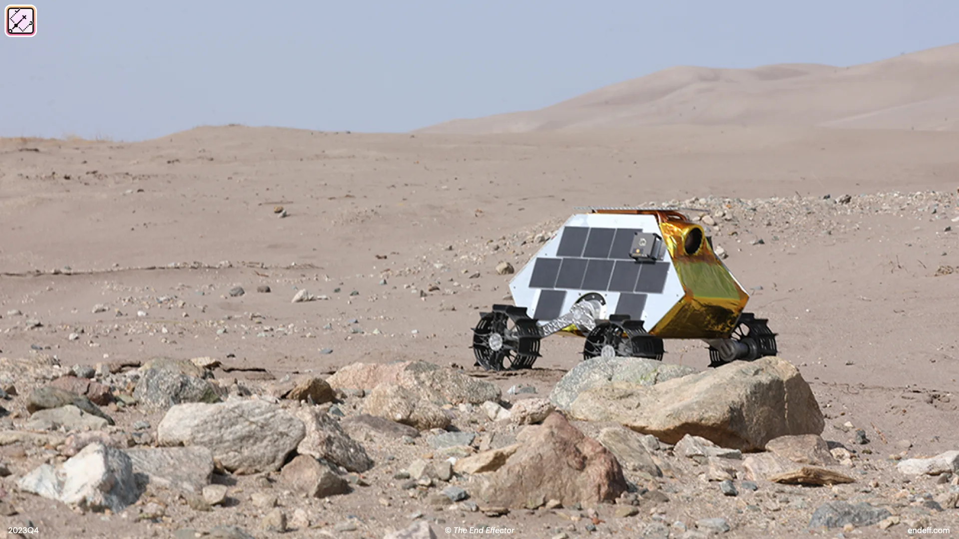
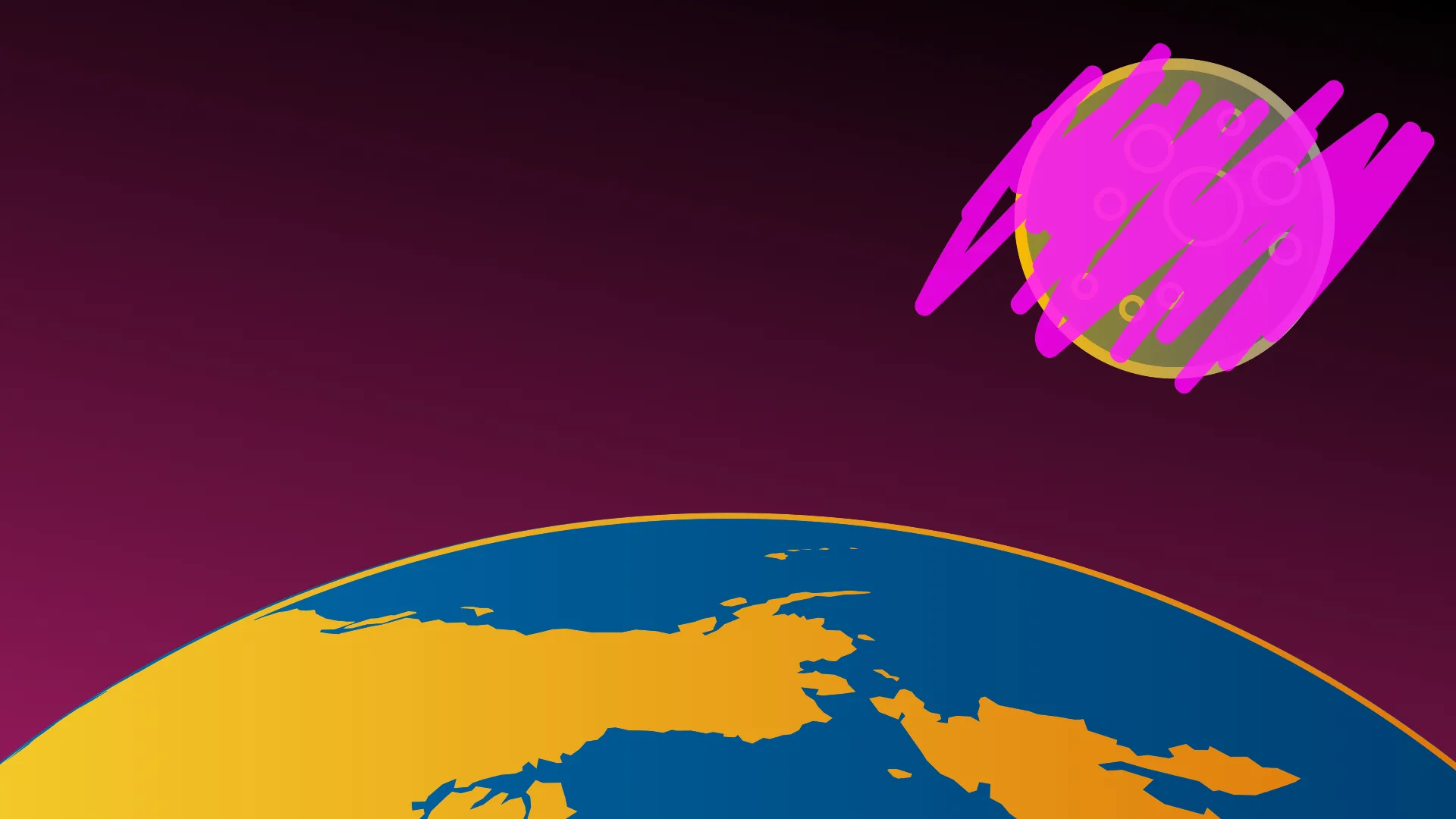
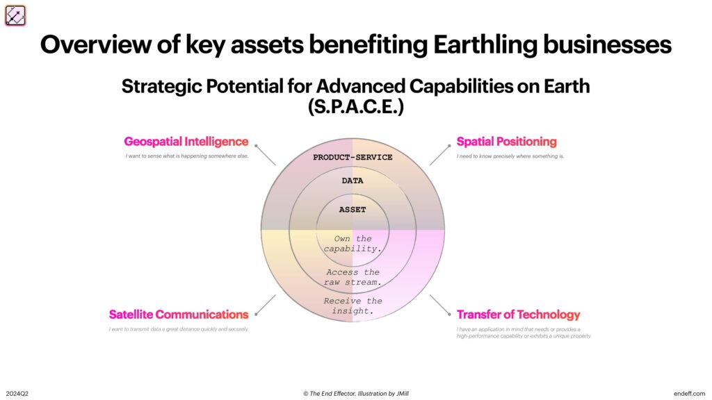
Space for Earthlings
A nine-part illustrated guide to what space operations mean for businesses on the ground, published through The End Effector. Each article opens with an original hero illustration: Earth seen through orbital rings, satellites, mines, and the occasional skeptical executive.
Every hero was drawn in Keynote, the presentation tool pushed well past its job description. The warmth is deliberate: the space industry sells itself with jargon and chrome renderings, and this guide is for executives who tuned that out long ago. So the series borrows its visual manners from children's books instead, flat continents, soft nebulas, a friendly orbit, and lets the writing carry the rigor.


Read the full series at The End Effector → Space for Earthlings
InstantOm
A tiny meditation moment, since 2008. This isn't a screenshot. It's the actual piece, running live. Tap it.
The mid-2000s internet took its enlightenment very seriously: meditation, yoga, reiki, psychic phenomena, all of it earnest. InstantOm was the gentle counterpoint: all of meditation, reduced to a literal push-button "Ommm." Self-effacing by design, a reminder not to take any of it, or yourself, too seriously.
The chant is real, though: recorded one March on the island in the middle of Lake Saint Francis. The hand-drawn Flash original made the rounds on CreativePro, Digg, Reddit, and Dave's Daily. When Flash died, JMill restored it himself: the original vectors and the om re-engineered for the modern web, so an eighteen-year-old piece of internet art still works exactly as drawn.
Design systems as artwork
Marks, palettes, and type systems built for the ventures and publications, each one designed from scratch.
Looking for the ventures, research, and code behind the visuals?
Browse the Archive →